
Design examples for the project you are building
Your AI-built UI:
what should you fix first?
Something feels off in the screen you built. Follow three real design revisions, understand the decisions, and find one change to try in your own project.
Before asking AI to rebuild the whole screen, check what a person needs to understand and do.
Your first screen works. The features are there and the buttons respond, but something feels off when you show it to someone else. Asking AI to “make it prettier” changes the colors and layout together. It becomes hard to explain what actually improved.
Watching what another person notices, and why they change it, gives you a more useful starting point. These three examples cover a consent screen, the scope of a revision, and a landing page layout. Keep one screen from your own project open as you read.
The first two videos are in Korean; the explanations below describe the relevant screens in English. The third video is in English. Creator guides linked from this article are currently in Korean.
1. Can someone tell what they need to do?
Imagine receiving an invitation to a group. The first screen names the group and lists what its AI does and does not do. You can read the information, but the decision you need to make only becomes clear at the buttons further down.
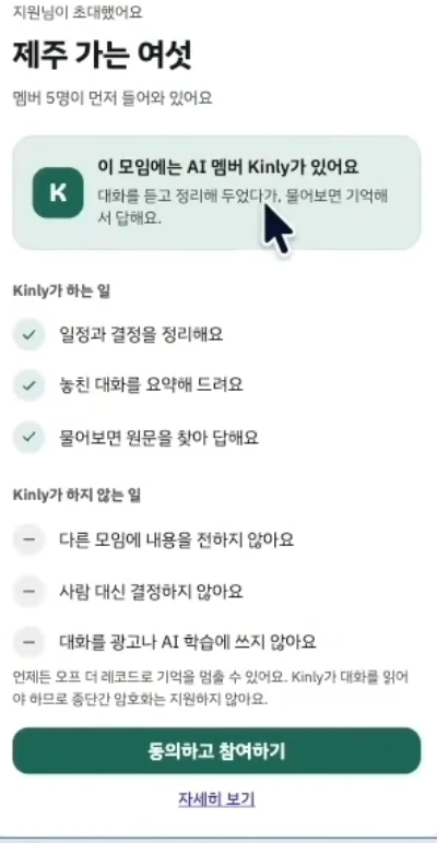

Eric Park compares several versions of a consent screen for a group chat app with an AI participant. In the second version, the heading becomes a question about joining. The explanation separates short key statements from supporting detail.
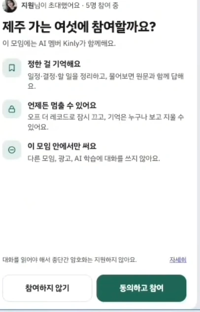
Notice the relationship between the heading and the buttons
The colors and illustration change too. For now, focus on the question the screen asks and the answers its buttons offer. The heading asks about joining, and the buttons let you make that decision. The AI's roles and limits help you decide. The revision gives the key points and the details different jobs.
Eric Park discusses the heading and explanation from 14:23, then points out a remaining inconsistency in button colors from 15:38. You also see what still needs attention in the revised screen.
Try it in your project
Pick one screen where someone makes a decision or takes an action: signing up, uploading a file, or saving an event.
- Write the decision in one sentence. For example: “Decide whether to save this event.”
- Read the heading and primary button together. If the heading only names the screen, could it explain the task or result more clearly?
- Keep the information needed to decide. Cost, visibility, and whether the action can be undone matter even when you want shorter copy.
For a personal calendar app, a heading such as “Event management” above a “Confirm” button may leave the action unclear. You could compare it with “Add an event” and “Save event.” This is INFLFEED's application example, inspired by the source screen.
Ask someone seeing it for the first time: “What do you expect to happen when you press this button?” If their answer differs from the intended action, revisit the heading and button before adding more explanation. The source does not report a user test, so this check belongs in your own project.
 13:19–16:13 · Consent screens and revision decisions · KoreanWatch segment Meet the creatorEric ParkEric Park compares versions of AI-built screens and explains his revision decisions.In this video, he discusses reference choices, a consent screen’s heading and explanation, and an inconsistency that remains in the buttons. Follow if you want to see how someone decides what to change next.Creator guide (Korean)
2. Are you changing only what needs changing?
You have fixed the heading. Now the colors and buttons need attention. You attach a reference and ask AI to “make it feel like this.” Suddenly the menu and input order change too. A revision can spread when you have not separated what to borrow from what to preserve.
Designbase uses a personal scheduling assistant to explain how to separate functionality and information structure from visual style. The slide at 04:23 captures that distinction.
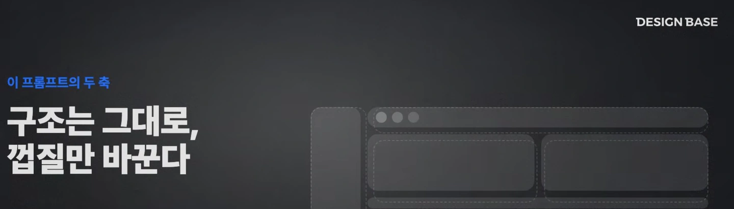

Decide what you are borrowing from a reference
In this lesson, the reference helps set the visual mood. Its information structure has not been shown to fit your users. Designbase explains how to preserve functionality, usability, structure, and layout while taking cues from colors, typography, spacing, and corners.
The useful takeaway is to define the scope around the problem you are fixing. It does not mean the structure must always stay untouched. If people cannot find a menu, its placement may need to change. But a button styling task does not necessarily need a new input order.
Add two lines to your next revision request
Here is an INFLFEED example. Adapt the details to your screen.
- Keep: the event input order, the save button's position and behavior, and values already entered.
- Change: colors and borders so the primary and secondary buttons are easy to distinguish.
With a reference image, you could add: “Use the way this image distinguishes the buttons; keep my menu and input order.” Then check appearance and preserved behavior separately. Look at whether the buttons are distinguishable, and actually save an event to confirm that the action still works.
Writing down what already works gives you something concrete to compare against. You can apply this to revision requests in the AI tool you already use.
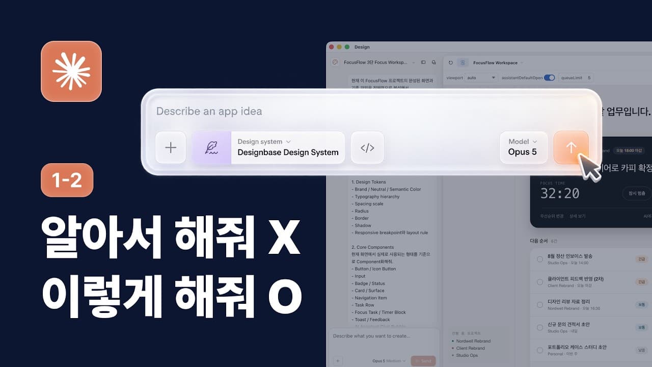 03:34–04:41 · Structure and visual style · KoreanWatch segment Meet the creatorDesignbaseDesignbase connects design principles with hands-on tool lessons.The sequence starts with a brief and references, then moves to reviewing and revising AI-built screens. Follow to learn what to decide before building and what to check afterward.Creator guide (Korean)
3. Do the heading, explanation, and buttons read together?
Once you know what the screen should communicate and what the revision should change, look at the layout. A heading, explanation, and button may each look fine while their relationship remains unclear.
Steve Schoger shows how he refines a landing page for a revenue management tool. At 09:45, he has already made some typography changes. The heading, explanation, and two buttons are centered above a product screenshot.
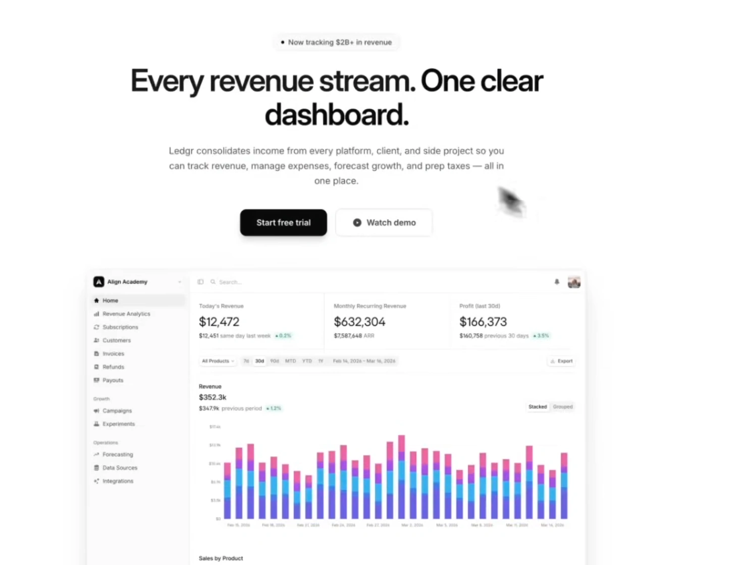

Drawing on a layout from his other work, Steve Schoger tries separating the heading from the explanation. The heading moves left; the explanation and buttons form a group on the right. The product screenshot becomes wider below them.
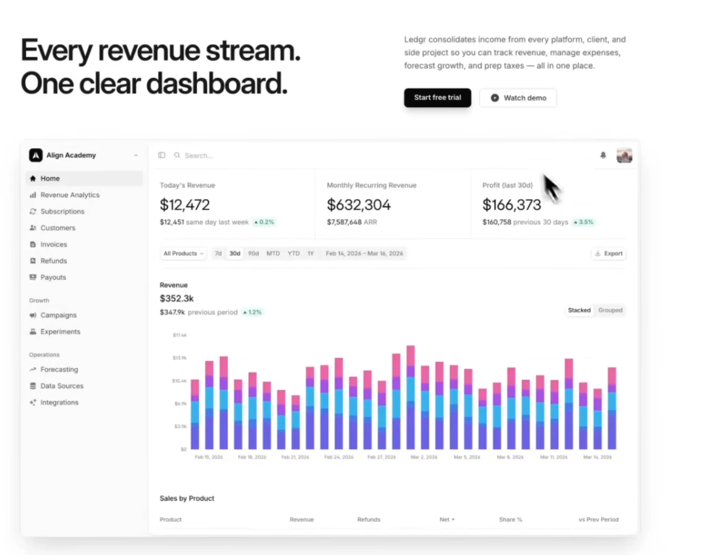
Look at the reading order before copying the columns
This scene does not establish that every landing page needs two columns. Steve Schoger describes his preference for left alignment and tries an alternative. The video does not report an experiment showing higher signups or better comprehension from this choice.
What you can borrow is the process of separating the heading's promise, the explanation behind it, and the next action. Here, the heading describes the product's value. The explanation and buttons offer ways to learn more or begin. The screenshot shows the product someone would use.
Find those three roles on your screen
- Heading: What should someone understand first?
- Explanation: What information do they need to understand or decide?
- Button: What can they do after reading?
INFLFEED's suggestion is to identify those parts, then compare one change. If the explanation and button feel disconnected, try bringing them closer. If every sentence has equal emphasis, try reducing the weight of supporting text. Changing the font, color, spacing, and layout together makes it harder to judge which choice helped.
Once the wide screen looks right, narrow the window, read the same content, and press the buttons again. Check for awkward heading breaks and buttons pushed out of view. Test the sizes your project needs instead of copying only the desktop arrangement.
This is a long English-language video. Start with 06:38–13:21 for the typography and first-screen layout decisions.
 06:38–13:21 · Typography and first-screen layout · EnglishWatch segment Meet the creatorSteve SchogerSteve Schoger, co-author of Refactoring UI, explains typography, spacing, and layout through concrete examples.His AI design videos show how he identifies changes and reviews the results. Follow if you want to understand the reasoning before borrowing a layout.Creator guide (Korean)
Pick one thing on the screen you have open
All three examples change a screen, but each focuses on a different problem: the decision a person needs to make, the scope of a revision, and the order in which information is read. Start with the question that is hardest to answer on your screen.
- Its purpose is unclear: Check whether the heading and primary button point to the same action.
- Every revision breaks something else: Write down what to preserve and what to change.
- You cannot tell what to read first: Compare the emphasis and distance between the heading, explanation, and button.
Save a screenshot, write one sentence explaining the change, and check the result at the same size. If a button cannot be used or content is cut off, fix that problem first.
Aim to finish today with one change whose reason you can explain.
Follow the thinking behind the changes
Get to know the people whose explanations helped you. Their Korean-language guides include starting points and verified channels.